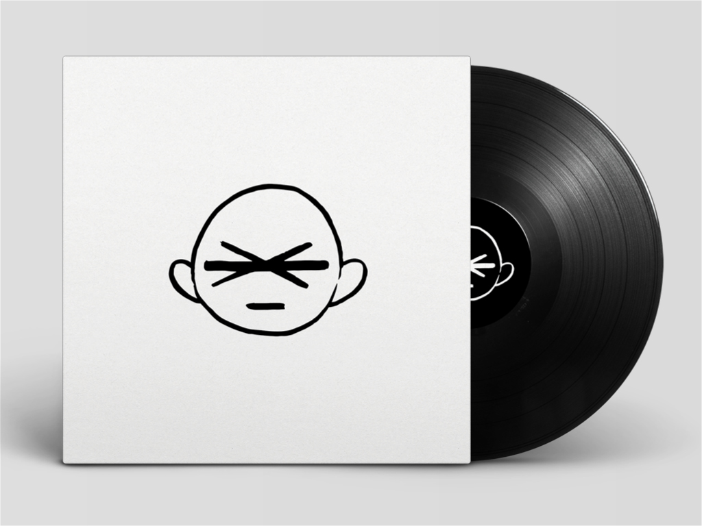
Boyfromthecrowd
Graphic Design, Packaging,
They are fast becoming one of the most popular independent band in England, “Where the bees come to die” is their debut EP. We created a new logotype to fit their iconic logo and produced a minimal cover with a punk feel that fits the roughness of their sound and image.
![](https://mir-s3-cdn-cf.behance.net/project_modules/max_1200/cea8e228747375.55d06e6ddaa92.jpg)
![](https://mir-s3-cdn-cf.behance.net/project_modules/max_1200/2e27d528747375.55d06e6ddcc03.jpg)
![](https://mir-s3-cdn-cf.behance.net/project_modules/max_1200/9707aa28747375.55d06e6ddbb11.jpg)
![](https://mir-s3-cdn-cf.behance.net/project_modules/max_1200/d1dd3528747375.55d06e6dddb1e.jpg)
![](https://mir-s3-cdn-cf.behance.net/project_modules/max_1200/bade9c28747375.55d06e6ddea96.jpg)
![](https://mir-s3-cdn-cf.behance.net/project_modules/max_1200/1ca5a328747375.55d06e6ddfa21.jpg)
![](https://mir-s3-cdn-cf.behance.net/project_modules/max_1200/365d4728747375.55d06e6de0c28.jpg)